 In the race for robo adviser supremacy, neither Wealthfront nor Betterment wants to be runner-up.
Love it or hate it, AUM, or assets under management, is the default metric by which investment management businesses are benchmarked.
Robo-Advisor AUM
Certainly, many automated investment services (or rather, robo-advisors) have been flaunting their AUM figures in recent years, to, well, I don’t know why, exactly, other than to beat their chest on how good they are at gathering assets.
The most vocal automated investment service for publishing AUM figures is Wealthfront, with periodic blog posts issued when the company passed the round numbers of $500 million, $1 billion, and $2 billion in AUM.
Taking the more subtle approach to AUM milestones is Betterment, long viewed as the runner-up to Wealthfront in the AUM-gathering contest since 2013.
Instead, Betterment mentions the number of customers it serves first (in part because they have more than Wealthfront, so they can be number one in that comparison), followed by the level of AUM represented by their customers.
Still, there are a few posts from Betterment that place dates on when the company crossed $1 billion (with 50,000 customers) and $2.5 billion (with 100,000 customers). One has to dig through trade publications like TechCrunch and Forbes to put a date on earlier AUM figures like the company’s first $100 million and $500 million, respectively.
Ok, fine. So how is that asset gathering coming along today?
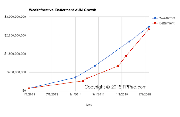
Graph of Wealthfront vs. Betterment AUM Growth
This morning I wanted to take a quick look at the AUM growth of the two leading automated investment services, Wealthfront and Betterment. But after 10 minutes of Googling, I had no charts or graphs of how each company is growing their AUM.
So I built a quick Google Sheet using the dates and AUM figures from most of the blog posts and articles cited above. Here it is!

Wealthfront vs. Betterment AUM Growth
So what is my biggest takeaway from this chart?
Betterment poised to overtake Wealthfront in AUM
Betterment has consistently lagged Wealthfront’s AUM since 2013, and Wealthfront’s growth rate was higher than that of Betterment, but then something changed around December 2014.
The rate of Betterment’s AUM increase accelerated, while Wealthfront’s growth rate generally remained the same from January 2014.
And the most recent figures for August 2015 show that Betterment has significantly closed the AUM gap with Wealthfront.
This being mid-August, and assuming Betterment’s faster growth rate continues as it has since the beginning of 2015: Betterment is poised to overtake Wealthfront in AUM.
What Happened to Betterment’s AUM Growth?
What happened to boost Betterment’s AUM growth starting around December 2014. I suspect the cause is:
So not only does Betterment have its own client acquisition strategies (web banner ads, TV commercials, ads on taxis and phone booths in NYC…), now the company has a new salesforce, if you will, of investment advisers who are using the Betterment Institutional service for their emerging clients.
This new cadre of advisers likely stands at a hundred or so today, but as the popularity and appeal of automated investment services expands, potentially thousands of financial advisers may be directing their emerging clients to use the low-cost service.
This is a totally new salesforce and asset gathering funnel that Wealthfront lacks today.
So in the race to be the dominant VC-backed automated investment service measured by AUM, the guard is about to change.
And nobody wants to be number two.


