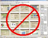
 Part of what I have been working on over the last week is a presentation I’m going to deliver in July to a group of specialty physicians. Since I consider myself technologically savvy and a creative user of presentation software (ok, yes, I still use PowerPoint due to my history with it), I’ve looked for resources on how to design and deliver effective presentations.
Most of us are very familiar with the common characteristics that plague most one hour presentations. There’s a title slide, introduction, an outline overview, all followed by a gratuitous spray of bullet points, hard-to-read graphs, and concluded with yet more bullet points. Thank you, the end!
One of the resources I found through a Lifehacker review is a presentation delivered by Dick Hardt at the O’Reilly Open Source Convention in 2005. This is such a drastically different style of presentation that I’m compelled to share it with my FPPad readers.
View Dick Hardt’s presentation by clicking here. (opens in new window, 15 minute presentation)
I’m sure you’ll agree that the presentation is a complete departure from the stylized bullet-point templates so ubiquitous with, dare I say it again, PowerPoint.
So take a cue from what you see in the presentation: Reinvent your presentation style and captivate your audience.


Trackbacks/Pingbacks
[…] Here’s another follow up to a topic I’ve discussed before on FPPad (Reinvent Your Presentation Style). […]